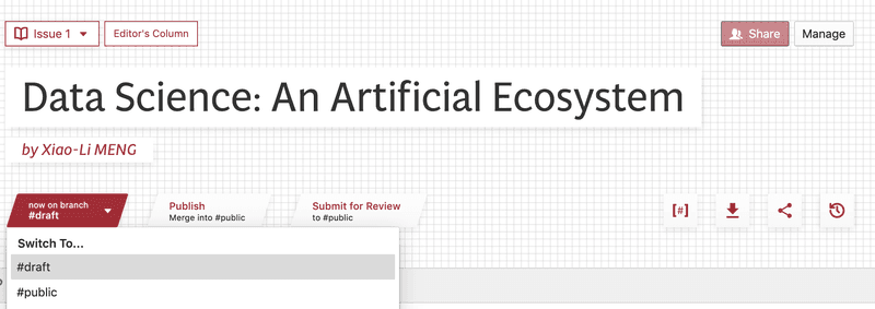
Hello! I’m writing to give everyone a heads up that a number of exciting changes are coming to PubPub late next week. No action is needed, but if you’re a community admin, you’ll receive this as an email with the option to preview your community using the new version. Otherwise, feel free to use this thread to ask questions, give feedback, and get ready for the changes!
Pub Look & Feel
Three months ago, we hired PubPub’s first full-time designer, the extremely talented Deepak Jagdish. You’ll see the impact of his work right away in your Pubs. We’ve fully redesigned Pub typography and header to look more professional and provide quicker, easier access to metadata like DOI, citation, downloads, and sharing — a commonly request improvement. You can see what the new version looks like now at the Harvard Data Science Review.
These are just the beginning of the look and feel improvements we’re planning for PubPub. In the coming months, we’ll be tackling page design, the admin dashboard, and providing more customization options, including different font options.
New Publishing Workflow: Branches and Reviews
Branches are a new feature that improve the way PubPub handles permissions and version history. Instead of saving public or private versions of a Pub like before, with branches you make changes to a private #draft branch, and then merge those changes with the #public branch. If an author doesn’t have permission to make changes to the #public branch, the merge will start a review process instead. Branches lay the groundwork for new peer review functionality, translation workflows, creating parallel versions of Pubs for multiple audiences, and more. For more information on Branches, see our Discourse post.
Pub Management
In addition to the reading experience, we’ve overhauled the Pub admin experience to make it simpler and more predictable, giving each page a dedicated management UI. The biggest change to Pub management is that the sharing panel has been replaced by Branches, which is where you manage permissions for viewing, discussing, and editing. Once the new version launches, we’ll update our Help Site with complete reference documentation for the changes.
Going Away: Discussion Channels
Due to lack of widespread use, we’re removing Discussion Channels from PubPub. If you have a Pub with Discussion Channels, we will be copying discussions from each channel into a new pub Branch with the same discussion permissions of the old channel. You can still host private discussions on the #draft Branch of any pub. In the future, creating a new Branch is how you’ll be able to host multiple different private discussions on a Pub.
Annotations (fka Discussions)
Annotations (the new name for Discussions) have been updated with the ability to add styling and rich media, and toggle between editing in the sidebar, for shorter annotations, and inline in the article when you need more room to compose a complex thought. We’ve also rebuilt the way Annotations are displayed on the page so that they’ll more predictably stay anchored to the text they refer to, even if the text changes or moves.
Full-Bleed Images & Embeds
You can now include full-bleed images and embeds in your Pubs! We’re looking forward to seeing how you use it to create striking visual Pub layouts and more usable interactive visualizations. You can see how HDSR is using full-bleed embeds for interactive visualizations in their first issue.
Community Colors & Customization
We’ve added more community design options, including a new Navigation Bar style, new options for the Homepage layout, and more. The most important update is the addition of a new light accent color. Upon launch, you’ll be able to set your new accent colors and explore the new options from the Community Settings page.
New Pub Header Styling Options
We’ve also added some new options for styling Pub Headers. In the new Pub Details pane, you can now select whether Pub header text should appear over the background image with a semi-transparent overlay (the default), or in white or black blocks without an overlay (HDSR, for example, mostly uses the new white blocks). These new options allow you to use more visually interesting background images, like patterns, without worrying about text readability. In the coming months, we’ll be adding more Pub styling options.
Collection Dropdown
In April, we released our Collections feature for managing metadata for Issues, Books, and Conferences behind the scenes. Now we’re introducing the first front-end interfaces based on collections. For now, those changes are small: if you browse to a Pub in a Primary Collection, we’ll show a dropdown with a list of other Pubs in that collection in the Pub header, using the Pub order you set in the Collection Manager. As you browse that list, PubPub will remember which collection you’re in and continue to show the ordered list for the collection.
At the bottom of the Pub, we’ll show a preview for the next Pub in the collection. These small changes are just the beginning — in the coming months, we’ll be working on improving and diversifying the experience of reading and browsing different kinds of Collections.
Mobile Support
We’ve worked on increasing mobile support across the board, but particularly when it comes to Annotations. The new inline Annotation view is the default on mobile, making it easier to read and post Annotations when you’re working on a smaller screen.


