Communities can create Pages to layout a wide variety of content. To help community admins layout their pages, we’ve created a ‘block’ system. Blocks can be linearly added to flow content across a page. The block types we currently support are:
Block types
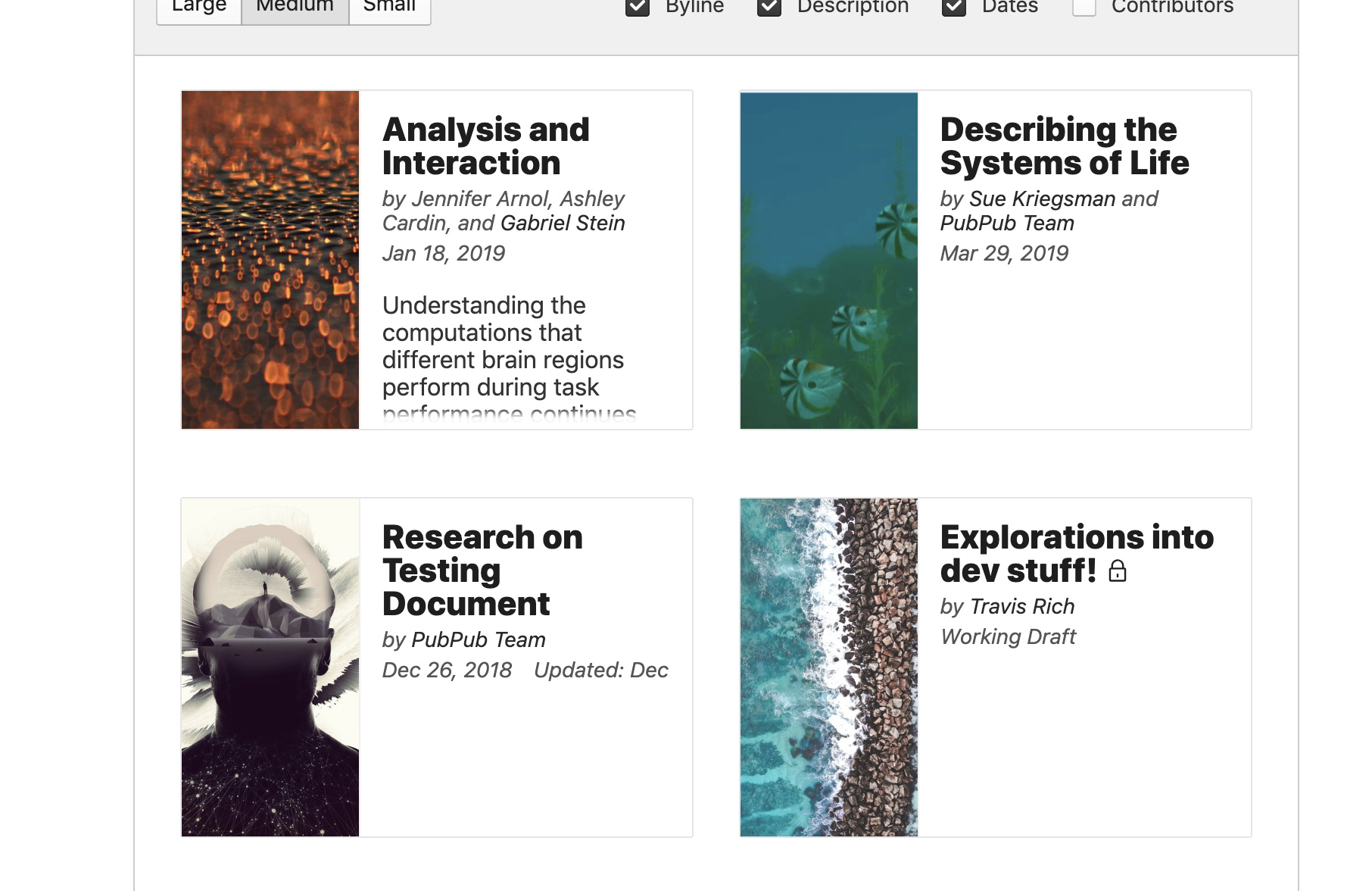
Pubs block: Used to flow a set of pubs using Pub Previews.
Pages block: Used to flow a set of pages using Page Previews.
Banner block: Used to create a banner that can have a title and button.
Text block: Generic rich-text editor to flow text.
HTML block: Input field that allows custom HTML to be rendered. We sanitize all input HTML to avoid security issues (e.g. XSS attacks).
Block options
Each of these blocks has a set of options that can be unique to that block type. Our current approach to laying out these options is not very sophisticated and can get a bit clunky for block types that have a lot of options.
Adding blocks
To help community admins understand which block they should be using for a given purpose, we’ve created a set of simple templates that may help guide decisions. The set of templates and the description of block types could be improved.
Design Needs
Our ultimate goal is to give community admins confidence in their understanding and capability when laying out a Page within their community. Clean layout of the blocks, their descriptions, and their options will go a long way to accomplishing this goal.
This is great. Only thing I’ll add is that Blocks should be thought of as eventually expanding beyond just Page layout, to other parts of community sites. At the very least, people will eventually need to design footers for Pubs – but there are lots of possible future options.
All this to say, as we build this for Pages, we should keep in mind that the interfaces for sitewide customization should ultimately be unified and potentially transferable – that is, you might want to use a block from a Page in the footer of a Pub and vice versa.
I have focused on simplifying the view, without providing any breaking changes. I’m not sure about the visual appearance and how the UI’s currently structured, therefore I’ve decided to proceed with more wireframe’y look.
Different structure
I believe ‘Pages’ menu, currently visible on the left side could be used as a table of content to provide more context and ease of continuum narrative between both: pages and blocks within these pages.
I have also moved the application - native menu (ie. 'Site) to the header to provide clearer distinction between the main navigation and a particular view.
More inline editing
I think it makes it more usable to provide a possibility of inline editing, especially within the blocks. I’ve decided to hide few options and prioritise others, more native to the particular kind of a block.
Self-contained
Each element is designed in a way to be self contained and re-usable across different contexts. This applies for blocks, but also UI elements within these blocks (ie. ‘Change preview size’ switcher).
Feedback & Figma
Please feel free to browse through Figma and see if everything’s clear. There are both multiple options to choose from, but also states of components. It’s not finished, however I could use some feedback about a) visual direction and your current UI kit b) general thoughts on the above c) specific feedback per particular component / block
Thanks so much for this post and the work! The Figma board is layed out beautifully and I really appreciate the designs stepping through the different states of each block, and the different options.
There are a lot of great ideas in here, though certain aspects of the design won’t work because of higher design decisions or uses. Let me try to outline those:
Block titles: The purpose of a block title is to add text into the block - not to label the block itself in this UI. Given that, not all blocks need a title. Really, only the ‘Pubs Block’ and ‘Pages Block’ need titles, as the Text and HTML blocks can add their own text, and the Banner block doesn’t use a title. Perhaps there is a clean inline-editing way to solve this, as you’ve suggested for other input elements.
Header bar and Structure: The header bar is constant throughout the rest of the community, so I’m not comfortable changing it up for this view. There are also scaling issues that make me prefer the left-hand list. Right now, we have ‘Pubs’, ‘Team’, ‘Collections’, and ‘Settings’ - but we may be adding more categories to that soon, and forcing those into the horizontal space of the header bar likely won’t work.
Add Block: The add block UI is a big improvement - I really like the direction. One thing that is lost in the mockup UI is the space for templates. Admittedly, we didn’t have many - but templates are something we want to expand on. Could you think of a way that a list of templates could be selected? Perhaps a sub-menu on hover? To clarify, templates are ‘per-block-type’. So you might have 3 types of Banner Block Templates that set different default options within the Banner Block.
Pub and Page Ordering: This is something we didn’t really explain - and our language isn’t perfect for. The ‘Order’ dropdown in the current UI allows you to both order objects, and select which ones will be displayed. What’s missing from the new UI mockups is a way to choose pubs or pages that will be ordered from the full list.
Tags: Related to Pubs and their ordering, the tags in this UI are not tags applied to the blocks - but a way of selecting a group of Pubs. Tags are applied to Pubs, and choosing a Tag in this UI allows you display all of the Pubs that have that Tag applied. The language of ‘Add a Tag’ doesn’t feel like it communicates that functionality. There may be something more clever to do that groups the ‘Pub Selection’ and ‘Tag Filtering’ steps into one UI.
Inline Banner editing: This feels like clearly the direction to go - it significantly simplifies the UI and removes some of the clunky image upload forms we have.
Block header bars: In practice, some of the blocks wind up being very long. For example, a Text block might have many paragraphs of text. Given this and the fact that we want the Formatting Bar to always be visible, we use top headers that lock at the top of the screen on scroll:
The bottom-aligned options look really nice, but I’m concerned they won’t function well on long blocks.
Overall, the general visual direction feels right. We use Blueprint for our components, and your mockups nicely fit with that style. There is a Sketch file for Blueprint if you ever want to pull in specific elements (it imports into Figma well).
Despite the long list of feedback - I am really appreciative of the work. There is a lot of great design here that we’ll be able to run with even if no future iterations were to be made. Thank you!
Thank you for the feedback; I’m very happy you like it!
I have updated Figma file, with the newest versions at the bottom. You can also edit it now Whenever I was not sure about some particular elements I’ve added inline comments that might also provide additional context.
Block titles
I have designed a simple component to add in-line titles with different states.
Header bar and Structure
I understand and agree, I might think of any other solutions to provide clear structure if you want to pursue this.
Add Block:
I’ve proposed a sample flow of adding blocks with the expanded menu on hover and labeling.
Pub and Page Ordering:
I thought about enabling two states: ‘Hidden / Visible’ for each block along with easy drag & drop to visually change the place in the order. In this way, it may achieve something you strive for with more inline approach.
That’s also a product change though, as here a user does not choose which pages are ordered, as all ones are by default, a user only indicates which ones are visible/hidden - the same way software for slides work (Google Slides / PowerPoint / etc.).
Tags
I’ve included simple filtering flow, whenever the label is selected the sub-menu appears with the explanation and possibility to clear filters with one click.
Block header bars:
That makes sense, I have not noticed it. I’ve changed the design accordingly, however at this point is just a UI refresh.
Also happy with this. I might play with the hover layout a bit - but this is certainly enough for me to start translating into code. Great!
This won’t work because of the number of possible Pubs people will have. Sometimes there will be hundreds of pubs, and you only want to show 3. It feels like a worse experience to have to hide 97 pubs. Similarly, we have a technical issue that our drag-and-drop library doesn’t support drag-and-drop across a grid of items (which is one layout option, example below).
At this point, I think we should start putting some of this into code though, so we can see how the elements feel in practice. We can get started on that this month, but have a bit of a backlog before we can start. I’ll sync up with the team today and start getting together the specs for the next project.


 One thing that is lost in the mockup UI is the space for templates. Admittedly, we didn’t have many - but templates are something we want to expand on. Could you think of a way that a list of templates could be selected? Perhaps a sub-menu on hover? To clarify, templates are ‘per-block-type’. So you might have 3 types of Banner Block Templates that set different default options within the Banner Block.


 Whenever I was not sure about some particular elements I’ve added inline comments that might also provide additional context.